 A large part of usability is the ease for how anything – from a Web site to a coffee maker and beyond – can be, well, used. Familiarity can have a significant impact on usability. If someone used something elsewhere that looks familiar in something else, they may be able to use this new item here.
I have experienced this first hand when traveling abroad. A couple of years ago my lovely wife and I visited Denmark, and this was the first time I did a fair amount of driving outside of the US. Where I did not speak the language, I was able to get around on the roads as the international driving signs and symbols were familiar to me. Even if the Danish words were not familiar, the overall symbol’s shape and color were, and as a result I knew what to do, and did not get into an accident.
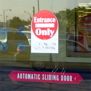
This came to mind recently on a trip to the Babies R Us store in Chicago. On the front entrance is a sign that reads “Entrance Only” however the words are inside of the international symbol for “do not enter” as shown in the accompanying photo The first time I went to the store, I paused for a moment as I got a mixed signal – the sign reads enter, but the symbol says not to. As many stores employ the green enter and red do not enter signs, my reaction was not unusual. Realizing this was the only way in, I proceeded to enter. Looking back as I did, I was not the only person to proceed with caution upon approaching this door.
Where I don’t design retail stores, I design Web sites. The adherence to consistency and commonly accepted standards is vital to the success of a Web site. If a Web visitor doesn’t know they should click on something, they won’t. Hopefully this is not referring to a “buy” button on a Web page. The above-mentioned sign may not have turned someone completely away from shopping at Babies R Us, but that was probably due more to the fact they drove to the store and eventually figured they could enter. With a Web site, you may not have that luxury of someone being that persistent, and they will seek a Web site that is more familiar to them.
Did you enjoy reading this? You are welcome to subscribe to The Hot Iron by RSS feed or by email.
Business •
Technology •
(8)
Comments •
Permalink
Comments
Mike, first of all, congratulations to you and Trace on the arrival of your new baby. Well done
There are indeed needs for standardization in the tech world. Especially with accessibility for the disabled. We are all disabled in one regard or another. Getting to that “buy” button can often be frustrating. I was very pleased to hear the guys at “Marketing Over Coffee” disdain web 2.0 because of its inaccessibility to screen readers. Standards should not be mandated, good ideas should rise to the top and become accessible by default. Why would anyone try and keep me from getting to “buy?”
!

Comment by Don Pedro
on 08/01/08 at 09:28 AM
Thanks Don Pedro!
Unfortunately people think more flashy and cool than core usable. That being said, you can be cool and flashy AND usable in my mind. You may have to make some trade-offs, but there’s nothing better than trading off for revenue!
mp/m

Comment by
Mike Maddaloni
on 08/01/08 at 09:34 AM
This reminds me when I worked at the Beverly Yogurt Oasis in college. When we opened the store, we forgot to take down the “closed” sign. Halfway through the day we noticed there wasn’t as many customers. That’s when we discovered that when the “closed” sign was up, not as many people come in.

Comment by
spudart
on 08/01/08 at 10:44 AM
Hey, speaking of confusing signs… Maybe my mind is just working slow this friday morning, but when I went to comment on this blog post, I got a little confused about the numbers by the comments and trackbacks. That bar read:
Business • Technology • (2) Comments • (0) Trackbacks • Permalink
It took me a little while to figure out what word the “2” was referring to. Granted you have bullets separating that words, and you’d think that would b sufficient. But the parenthesis threw me off, because normally parenthesis are put after what they describe. Here you have the parenthesis before the word. I would either:
A) Put the (2) after the “Comments” and have it say: “Comments (2)” or
B) Elminiate the parentheis altogether and just let it say “2 Comments”

Comment by
spudart
on 08/01/08 at 10:47 AM
Hi Matt - Good point on the comments count presentation… I have put it on my to-do list.
Now that I am thinking about it, it should not only show the number of comments, but invite people to comment too!
mp/m

Comment by
Mike Maddaloni
on 08/01/08 at 11:39 AM
:)

Comment by
spudart
on 08/01/08 at 12:25 PM
Nice post. I completely agree with you that a web site should be familiar in order to get traffic.

Comment by
Moumita
on 12/29/08 at 05:50 AM
Great post. The confusing symbols for a web site may hamper it’s business but confusing road symbols can take life. I think all of them are dangerous.

Comment by
Shiva
on 12/29/08 at 05:55 AM
Post a Comment
Note: Comment moderation is active, and your comment will be viewable once it is reviewed.

 A large part of usability is the ease for how anything – from a Web site to a coffee maker and beyond – can be, well, used. Familiarity can have a significant impact on usability. If someone used something elsewhere that looks familiar in something else, they may be able to use this new item here.