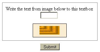
 If you have ordered something online or posted a comment to a blog, you have seen captcha. It was originally developed as a method prevent robots from automatically submitting forms on a Web site by requiring a person to visually view text in an image and enter its value in the form, something a robot should not be able to do.
Where it has a noble purpose to prevent bogus information going to a Web site owner, it is a roadblock to someone who is visually impaired using a form. And as you can see from the example I grabbed from a Chicago-based Web site, it can be hard for those who do not have any visual impediments to decipher.
I made a decision to not use captcha on The Hot Iron or on Dunkirk Systems’ Web site. I do have logic in the forms to try to thwart bogus submissions, but they still get through. Comment moderation is enabled on this blog, requiring me to approve a message. Where this slows down legitimate comments from going live, not to mention more work on my part, it provides a better user experience for you the reader. This I value more than deleting a few offers for pills and watches.
As for the Web site I took this captcha example from... their privacy policy and Web site copy did not make it clear what was to be done with the information submitted using the form, so it was another strike against be using it.
Technology •
(10)
Comments •
Permalink
Comments
Thanks Mike for getting the word out about this very real hassle. I try to make the inaccessibility point clear to the site’s web master whenever possible. Google only recently made an audio capja available to blind and visually impaired persons. But poorly designed web sites continue to proliferate. The strange thing for me is that a truly beautiful web site is usually accessible to screen readers. One almost has to go out of their way to put up the barriers. Yet, time and again, poorly designed web sites are born. Utility, accessibility, form and ease of use are all the best factors to make any web site “look” good. As in architecture, form follows function and leads the way towards beauty.
Want to see a really bad site? MLB’s media center has over 600 links on one page! Clutter!
Cheers,
Peter

Comment by Don Pedro
on 04/18/07 at 11:57 AM
And what is usually the response/reaction you get from the Web designer/developer (sorry, I don’t like the term Webmaster!)?
I believe that many people are surprised that many people are using accessibility devices or software or browser enhancements, more than they would think. Even having something as simple as ALT text on images goes a long way.
mp/m

Comment by
Mike Maddaloni
on 04/18/07 at 12:05 PM
I do get responses. Sometimes it’s just a quick fix. But I have managed to impress web dictators enough to sometimes actually make the site more accessible. Capjas though are another story. They have to get blasted by lots of folks before they will add an audio version to the site.

Comment by Don Pedro
on 04/18/07 at 12:38 PM
I can’t stand captchas!

Comment by
David Dalka
on 04/18/07 at 03:41 PM
I couldn’t agree with you more - I cannot stand CAPTCHAs. Hate em. I can see perfectly well (with my contacts) but on more than one occasion its taken me 3 or more attempts to get a random image that I can actually decipher. Ticketmaster seems to use the worst CAPTCHA service ever - and the fact that you’re in a race against the clock on that site its a pretty bad situation.

Comment by
Jeff Kenny
on 04/20/07 at 12:11 AM
Excellent point about Ticketmaster, and there is a site where if you don’t use it, then you don’t get the tickets.
So other than us who are for usability… what can we do?
mp/m

Comment by
Mike Maddaloni
on 04/20/07 at 08:13 AM
A good question about what can be done. I’m hardly a techie so my attempts go towards harassing the architects of the site. Generally speaking, most poor designs seem to me to be Bourne out of laziness or misunderstanding. Some executive has made the decision that your inconvenience is less important than their bottom line. Point out to them that their bottom line is affected by reduced sales and they will, er, might jump. I can still remember the first time Ticketslave used those letters; it shut me out of some show. Was it Metallica or or an ABBA cover band? I forget. But I haven’t used their “service” since.

Comment by Don Pedro
on 04/20/07 at 08:54 AM
I have software that skirts around all of Ticketmaster’s captcha and security measures. The software can also open UNLIMITED windows to get seats. When my software runs, its like having 100 people on 100 computers pounding on Ticketmaster’s site. It’s freakin’ awesome. I use it when events go onsale, and I use it to look for ticket drops to sold out events. I crush everything.
You can have it too for $5,000 per month.
-Farrell Ackerman; Mr. Tickets; PA

Comment by
anonymous
on 05/13/07 at 09:28 AM
Well Farrell… that wasn’t exactly what I had in mind for eliminating captcha. :) But you prove a point that technology can be thwarted by other technology.
mp/m

Comment by
Mike Maddaloni
on 05/14/07 at 05:01 PM
$5,000 is about what one has to pay to see a 30 year old band do a re-hash of their glory days of long ago. I just clicked on the audio capja for a google user group. Talk about audio clutter! Give it a listen sometimes. No soup or tickets for you!

Comment by Don Pedro
on 05/15/07 at 09:09 AM
Post a Comment
Note: Comment moderation is active, and your comment will be viewable once it is reviewed.

 If you have ordered something online or posted a comment to a blog, you have seen