Web Images Physical Dimensions Should Match Display Dimensions
One of the great things about the proliferation of content management systems and blogging is the ability to publish whatever you want, including text and photos and images. One of the not so great things about this is that things can be published in a far from optimal format, leaving quality on the floor in the name of convenience. Specifically, I am writing with concern over how images and photos are often published and look fuzzy or are slow to load. This can be easily remedied with simply realizing the physical dimensions of an image to match the desired display dimensions.
Here’s an example to illustrate my point, literally, of what we at Web consulting firm Dunkirk Systems, LLC advise to our clients all the time. As it’s a nice and cold day in Chicago as I write this, why not use a photo of Panama City Beach, Florida taken earlier this year, as shown below.

The dimensions of the photo below are 480 pixels wide by 318 pixels high. The original dimensions of the photo were 2,048 x 1,356 pixels, which is not only much too large to display within the layout of The Hot Iron but too large for most blog feed readers. Using the most basic features of PhotoShop, I reduced it to the size above. As a result, the physical dimensions of the photo match the display dimensions, not to mention the size of the file being much smaller as well.
The alternative to this would have been to add the photo to the blog post and resize its dimensions “logically” by adjusting the HTML display dimensions. This would have had 2 negative impacts on the beautiful picture. It would have appeared grainy or pixilated as I am simply squishing the image without altering its physical size. Also, it would have taken longer for it to appear, as the filesize would be 10 times larger than the physically resized image.
Larger images logically resized appear more than you would think, or now would like. I see it on blog posts, Web sites for businesses as well as email newsletters. The user experience is often where the entire page loads and the photo or image slowly appears, line-by-line, from top to bottom. Many times I have been tempted to contact the owner of the Web site or newsletter, however from past experience such submitted issues go unresponded to.
So how do you resize your images? Many of you may already have software to do this installed on your PC or Mac – some may come from the OS itself, or in the case of Windows it may be pre-installed software from the hardware vendor. Some digital camera software comes with basic editing tools. Some online photo sites may offer editing and resizing capabilities as well. You can also acquire a full copy of Adobe Creative Suite, or its lower-priced cousin PhotoShop Elements.
With a little bit of work, you can provide a greater experience to your readers with good looking photos and images displayed in an optimal way.
Did you enjoy reading this? You are welcome to subscribe to The Hot Iron by RSS feed or by email.
Surrounded By QR Codes In A Chicago Transit Car
Where last time I talked about QR codes on a Chicago transit station platform this time I am stepping into the car, where I am surrounded by a single ad campaign and large QR codes, as you can see in the photo below.

The photo shows an ad for The Real Southwest, which is being sponsored by the Tucson, Arizona Convention and Visitors Bureau. All of the ad spaces in this train car are for the same campaign, which is becoming more and more common place. What is interesting about the photo above is that it is of the ad affixed to the ceiling of the train car! The photo below shows a similar ad, but at eye level, and with a one word difference – can you find it?

The actual train car I was riding on was full so I was not able to get other pictures without annoying other passengers any more than I was when I took these. Not every ad had a QR code on it, but there was always within a standard field of vision.
Instructions Built-In
What’s unique about this ad series is that the instructions are prominent within the ad copy. Many times if there are instructions along with a QR code on what to do with it, they are in small type and located in the corner of the ad. It tells you to get the Scanlife, not to download a QR code reader, which is also unique. And by placing the URL to scanlife.com alongside the code is, again, unique. Of course if you know what a QR code is you will just scan it.
All of the codes I scanned took me to the same web page on the Tucson Web site. What would have been interesting was if they had different QR codes, thereby being able to track which one people scanned to get to the Web site, or having a unique QR code on the ceiling to track how many people look (and scan) up.
What are your thoughts on this ad – is it as unique as I have said it is, or just a good campaign? Please share your thoughts in the comments of this post.
Did you enjoy reading this? You are welcome to subscribe to The Hot Iron by RSS feed or by email.
3 Words For Your Web Site In 2011
 With the start of a new year, many people come out with predictions or trends they see for the coming 12 months. There’s plenty of great writings out there already, so I will not add to the list (if you want to read a good one, there’s Emily Brackett’s Top 10 Web Design Trends for 2011 That Will Help Your Small Business).
As I was pondering my 3 words for 2011 as presented by Chris Brogan I thought of suggesting 3 words for your Web site for 2011. These 3 words are “guiding pillars to focus on in the coming year” as Chris describes.
My 3 words for your Web site are – Measure, Function and Backup.
Measure – Any decision you make for your Web site (or for your business for that matter) should be the result of facts or planning. Whether these are successful or not are determined by the numbers, and you must measure them to ensure if you are on track, way off, or need an adjustment. Many people do not measure their Web site. This starts with the hits, which many people use Google Analytics to measure. It then continues with feed tracking (for blogs or RSS feeds), social media links, surveying and so forth. If you are not doing any measuring, do so. If you have no data to work with, start collecting it.
Function – As much as a Web site must have great content and look good, it must also work. Links should not be broken. Forms should submit properly and accurately process the information entered. Any unique functionality should not only work but also work in all browsers. Where you may think these examples should be a given, many times they are not. The simple thing is to test your Web site on multiple browsers – Internet Explorer, Firefox, Chrome, Opera, etc. – and on multiple platforms – PC, Mac, Linux, mobile devices – and see how they look and perform. Ensuring your Web site works means it is working for your customers.
Backup – Do you have a backup strategy for your Web site? Or do you even have at least one, single backup copy of your Web site stored someplace secure? If not, then you should. Develop a plan of what to backup and how often. Backups can be as simple as a database dump or export of orders, blog posts or customer data. It should be done on an interval that works for you. One you create it, test the backup plan, as a backup is no good if you can’t restore from it. Fortunately your Web host more than likely has some form of backup procedures in place. But why wait until there’s a problem to fund out they don’t?
There are a lot of things to consider with regards to any Web site, as I have presented before with The State of Your Web Site. These are 3 core areas from which you can build the success of your Web site. If you have any questions or comments on any of these, please enter them in the comments area of this post below. If you need help to make these happen, please contact me personally.
Did you enjoy reading this? You are welcome to subscribe to The Hot Iron by RSS feed or by email.
Is The NFL Moving To A Unified Web Site?
Over the holidays I caught up on reading and responding to email, in the process managing both my personal and work email inboxes to zero. One of the messages I processed came from the National Football League, or NFL. As I am a New England Patriots season ticket holder, this is probably why I received it. An image of the short message is below:
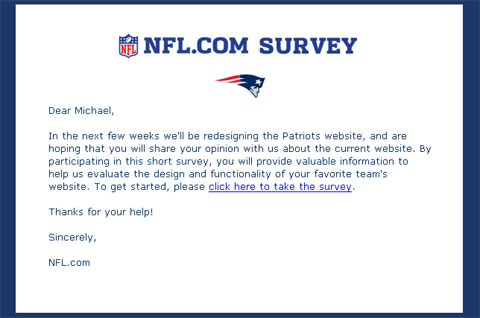
The message text read as follows:
Dear Michael,
In the next few weeks we'll be redesigning the Patriots website, and are hoping that you will share your opinion with us about the current website. By participating in this short survey, you will provide valuable information to help us evaluate the design and functionality of your favorite team's website. To get started, please click here to take the survey.
Thanks for your help!
Sincerely,
NFL.com
After reading it and re-reading it, as well as taking the brief survey, I had one question, are NFL team Web sites moving to a unified platform?
Such a move does not surprise me, as other sports leagues have taken a similar approach. Major League Baseball, or MLB, first comes to mind as they made this move many years ago. Other US pro sports leagues, such as Major League Soccer and the National Hockey League also have. The National Basketball League (NBA) appears to have, but the Boston Celtics Web site appears different from the other NBA team Web sites, though it does not mean it’s not on a common platform.
Having all team Web sites on a common platform provides many gains, which outweigh the negatives. First and foremost is cost and technical management – no need for 32 separate Web sites (there are 32 NFL teams), where you technically have one. Each team Web site (or section of the NFL site) will have a similar navigation structure, making it easy for the Web visitor to navigate from team-to-team. You still have your team-based content writers and coordinators, or whatever their title would be. You can also better leverage content across team sites with relative ease, both the written word and rich media, and the latter may be driving much of this. MLB has been very successful and providing broadcasts and audio and video of games, and charging for it. The NFL, which is known for its high-quality NFL Films, will probably make a similar offer.
If there are any drawbacks from combining Web sites is the complete control of the look and feel and overall content of the Web site. This will be more of an internal team issue than for the fans. Hopefully combining all Web sites will force all teams to offer a consistent level of quality content and design, where currently some team sites offer more content than others, not to mention some have a better design as others.
I performed a few searches and did not see anything specifically mentioning any form of unifying move. I welcome any thoughts and opinions on this, not just from a sports standpoint but from a branding and design view as well. Plus any insight into if the NFL is actually doing this is welcome too.
Did you enjoy reading this? You are welcome to subscribe to The Hot Iron by RSS feed or by email.
Back From TechEd Europe Conference With Nokia
After a whirlwind trip to Berlin, Germany for the Microsoft TechEd Europe conference and the opportunity to meet and query members of Nokia’s enterprise mobile team among other Nokia staff, I am back in the Windy City with a head full of thoughts and ideas.

As I get settled back and unwind from this learning experience, I will be writing more detailed posts on what I took away from the people I met over the last few days. Look for more information on Nokia’s next flagship device, the E7, as well as information on how it works and where ti fits in with everything else Nokia is working on now.
E7 Coming Soon
One piece of information I will share now is the answer to the most asked question of me to relay to Nokia staff – when the E7 is coming out. Their answer is Christmastime. It will be a phased global launch over the next few month, with availability in some countries by the end of 2010 and the rest soon after in 2011. Nobody told me which countries would be when, but it was inferred markets such as China and India would be in the first phase, and there was no specific indication when it would be available in the US.
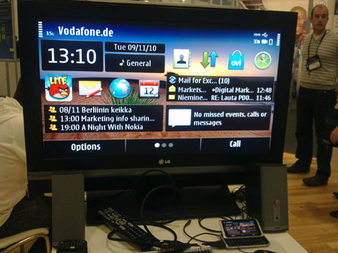
In the meantime, I will share this photo of an E7 hooked up to an HDTV – it has an HDMI out port and with a cable it can be hooked up to any HD device with HDMI input.
Special thanks to Nokia and WOMWorld/Nokia for sponsoring all of my travel, accommodations, hospitality and admission to TechEd. Rhiannon from WOMWorld/Nokia was a gracious host and facilitator and did an excellent job ensuring all was coordinated, especially keeping us well fed. It was also great to again see Dennis Bournique from Wap Review and meeting Craig Richards from Geek Computers. Kudos to the Hotel Berlin, Berlin, an excellent hotel with great service.
Did you enjoy reading this? You are welcome to subscribe to The Hot Iron by RSS feed or by email.

