7 Vital Web Site Updates For The Pandemic

As businesses and individuals return to work, of equal importance to safety and protection is communications – we need to know as much as possible to make informed decisions. One area I have found lacking is with the Web sites of businesses and professionals. Many sites I see in the course of trying to return to normal suffer from a dearth of vital information needed for people to determine if they are still operating or not, and if so how.
Here I offer seven recommendations for your Web site to indicate the status of your business and how to help return to normal as possible these days.
Add alert functionality upfront – If there’s something important you want people to know, put it right up front. How? You can have a brightly colored alert banner anchored to the top of your home or all Web pages to inform people. A browser pop-up can also achieve this. As you may not have this functionality already, you might have to check with your Web site consultant or look into the services of your Web site platform to see how you can gain this. It may be easier than you think, and even if it comes with a cost, it will be well worth it.
Are you open? – This may be obvious to you the business owner, but not all Web sites I visit make it clear. The messaging may be nested into the design of the site but not easily found. Using the alert functionality mentioned above is one way to achieve this. Another is to look at all of the content of your site and make whatever adjustments needed to indicate so.
Update location, hours and contacts – Due to changes in your business, have you relocated? Did you change your hours? Do you have different contact information? Is this new information reflected on your Web site? If not, it should be.
Changes to your business practices – If the experience your customers will have with you has changed as a result of COVID-19, indicate this on your Web site. Will someone have to wear a mask? Do you have shielding in place? Is distancing required? This is important for people to understand if they can still do business with you and will give them the peace of mind they may need that it's safe to do business with you.
Add social media feeds to your site – Many businesses and individuals are updating their social media accounts more than their Web site. Why not kill two birds with one stone and put the feeds from your social media accounts onto your home page? How to do this varies depending on your site and you should follow the previous tips on checking your Web site provider or consultant.
Start an email list – Many businesses found out the hard way when they had to shut down that the only contact with their customers was when they came through their door. As my good friend John Wall says on his Marketing Over Coffee podcast, you've got to have a house list. Every business, every professional should have an email list with the sign up on the Web. There are many different services where you can set up a mailing list, some are even free. For example, if you are reading this by email, I use MailChimp in order to create and send the emails from my RSS feed. You can customize templates and the content to send to your customers and contacts.
Add e-commerce – There's no time like the present to take online payments or sell products and services online. Just last week, Chipotle just started doing this by selling clothing and other items online. Now the company that was all about selling burritos and bowls is now into merchandising. If you don't have a specific new product idea, simply having the ability to take credit cards is important. It can be as simple as setting up a PayPal account and pay by the transaction by transaction, then upgrade to a credit card service when you get more volume.
Deconstructing vital Web site updates
As social media and other services have evolved, much business content and functionality, even e-commerce, uses them. Your Web site may have been neglected or completely out of sync with other messaging you have out there. As Coronavirus remains out there, I recommend these vital Web site updates to ensure it remains an integral part of your business.
This is from The Hot Iron, a journal on business and technology by Mike Maddaloni.
Did you enjoy this? Subscribe to The Hot Iron by RSS/XML feed or Read by Email
Business • Strategize • Web Design • (2) Comments • PermalinkMy Brown Bag Lunch Presentation On Web Accessibility
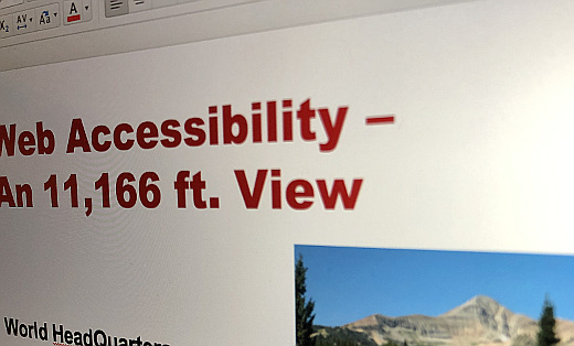
Recently I gave a “brown bag lunch” presentation on Web Accessibility. For those not familiar with the term, it refers to an informal business gathering at lunchtime where everyone brings their own lunch (thus the reference to brown bag) and one person gives a short presentation followed by a discussion as everyone eats their meal. I have participated in and presented at many of these over the years and they are a fun, casual way to learn and connect with your team.
The audience for this were fellow members of World HeadQuarters, a co-working space in Appleton I joined a few months back. In this case, the presentation was virtual as the space is not open these days. That being said, it was as close as you can get to the in-person experience with about a half dozen online participants.
A Broad Topic In Short Time
How do you talk about Web Accessibility in about 10 minutes, and to an audience that this may be completely new to them? This was my challenge, and I gladly accepted it. I decided to keep it at a high level, not getting into too much jargon while giving the audience information and takeaways for them to explore more on their own.
I’d like to share my presentation here. While there is no recording of me actually giving it, the slides I prepared provide the essentials. The slides are embedded below for viewing from SlideShare, and you can access a PDF of it here.
I welcome any feedback, as well as if this was useful to you. As I look back in on it, I can think of changes and refinements to it, like anything you review after the fact. It was also a great opportunity for me to keep my presentation skills sharp.
This is from The Hot Iron, a journal on business and technology by Mike Maddaloni.
Did you enjoy this? Subscribe to The Hot Iron by RSS/XML feed or Read by Email
Strategize • Web Design • Web Development • (0) Comments • PermalinkMike Maddaloni Featured in Associated Press Article on Amazon Ads
 They’re everywhere. They’re annoying. But they’re effective.
Where the above 3 sentences could apply to a lot of things, here I’m talking about Internet advertising. From banner ads to text ads to search ads, they are what supposedly finances the Web site you are on, or at least that’s the idea. The earnings from ads here on The Hot Iron this month won’t even buy me an hour of on-street parking in my city. But some ads, especially those found when searching for something, can be very lucrative.
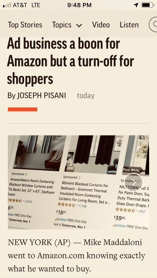
My thoughts on these ads and how they are pervasive on Amazon.com was featured in an article published today by the Associated Press. Titled “Ad business a boon for Amazon but a turn-off for shoppers” by Joseph Pisani, I was one of a few who talked about the ads and their impact on consumers. An example of a recent frustration I had when searching for a product on Amazon opened the article.
I connected with the author through Twitter, seeing a tweet of his asking for people to share their experiences on searching for products on Amazon. The example I stated was real – when I was searching for one product the results showed a different “featured” brand, followed by other brands then 4 or 5 items down the list (differing on various searches) I found the brand and model I was looking for.
Is this type of advertising deceptive? It’s hard to see the small text or icon stating the other items are ads. These days I look for these things, others may just buy the product that paid to be at the top of the list. The ads on Amazon are unique as most all of the items are for sale through the site, and I say that as Amazon even displays paid ads for products on other sites.
The reach of the AP
Articles published by the Associated Press are often carried verbatim or in a modified form on many news outlets. As a result this article can be read on the Web sites for the New York Times, Fox Business, ABC News and even in the Spanish Edition of the San Diego Union-Tribune. Thanks to Jonathan Hoenig for first bringing the article to my attention.
I welcome your thoughts on these types of ads and if they have impacted you, as well as any comments on the article in general.
This is from The Hot Iron, a journal on business and technology by Mike Maddaloni.
Did you enjoy this? Subscribe to The Hot Iron by RSS/XML feed or Read by Email
Business • Strategize • Technology • Web Design • (0) Comments • PermalinkLiterally Promoting Search in 1999
It’s been said if you can’t find anything on the Web by searching for it, it may as well not even exist. Since Google’s launch over 20 years ago that has certainly been the mantra, as their single search box with precise search results trumped all other search engines out there to become the dominant search destination it is today.
Around that same time, I felt the same about search, but on a slightly smaller scale, though with an international reach. I was literally promoting search for the Intranet portal for a global professional services firm in 1999.
Search Hidden and With Good Reason
In 1999 I became the manager of the front-end development team for this portal, which meant I was responsible for leading the team creating and enhancing its Web pages. As part of the role, I had to evaluate the functionality and design we had already, as the portal was being developed by a consulting team that was rolling off the project. When I evaluated the search function, by my best approximation it was poor to non-functional and of no value to anyone using it.
As I quickly came to learn, search was not a priority for the portal. The business sponsors didn’t even want people to simply search for content, rather to use a complex, nested set of 3 drop-down lists to select a category for which content would be presented. If that sounds convoluted, it was. The categories, or taxonomy, mirrored the structure of the firm. The idea was you would navigate to where you “worked” and voila, there would be content waiting for you.
Or so one would think, however this wasn’t always the case. Many times there wasn’t any content there, especially in the early days to months of the portal. But that wasn’t that my concern, as we had an entire other team working on getting content into the portal. The concern for my team and I was to ensure the front-end of the portal worked and was usable.
There was no real urgency to make search function well and have a great user experience as accessing it, as it was literally tucked behind an unlabeled icon of a magnifying glass on the second page of the portal, one you would miss on first glance. There was an option on the first page of the portal prominently labeled search, but it simply led users to a list of public Internet search engines, such as Lycos and Yahoo. Remember, this was 1999.
A Better Way to Content
After the launch of the portal, we decided to tackle search. The task of working on the search engine went to our top developer. He had both a programming and mathematics background, and was eager to get search working. After some time, he was successful, and it was a highly functional and useful feature of the portal, though most people still didn’t know about it. We added a text label to the search icon and others near it where it wasn’t obvious what their functions were. Even then, you had to click the icon which took you to another page where you got a search box, adding steps (aka barriers) to get to the content you want. Over time we found that portal users were using search, and we on the development team used it to validate testing for content. Even with this new label, search was still not a prominent feature on the site, nowhere to the degree I felt it should be.
Making the Case for Search and navigation
With the initial launch of the portal and other changes including the search function behind us, it was on to version 2.0. There was a laundry list of features wanted for the portal, and one was a new user interface. As my team worked through designs and functionality, they proposed putting a search box in a prominent position on the Web site, at the top left corner, literally promoting it from obscurity. Studies of people using Web pages have shown consistently over the years people start at the top, go across the top and down the left side. By placing the search box and button at the top left, there was no extra step needed to get to search results.
I was pleased with the work and designs we put together, and then we started the process of presenting it up the food chain of the leadership for review and approval. We knew we would have tweaks and adjustments to make, but we were hopeful much of the work we did would persist, especially search.
When we presented it to the director of the development team, my direct manager, he liked it. The next step was to present it to his manager, who was the overall director of technology. But he didn’t like it. He felt it went against the goal of navigating to content and wouldn’t be approved by the top leadership of the team. We pointed out the 3 drop-down lists remained, and people could still choose to use them, as well as the work we did to improve the search function. My director was also reinforcing this, from a usability standpoint, so the busy consultants in the field could get to the content they wanted. After hesitation he agreed we could present the search box design to senior leadership but that he would not back us up on it. This was fine by me, as myself and my director would be the ones presenting it.
Shortly after this less than exciting meeting, we had the meeting with the senior leadership and business leaders for the portal to present our proposals for version 2.0. We were in a beautiful and expensive conference room with cutting-edge functionality, very expensive for that time. We had an orchestrated presentation where myself and my peers would be presenting their team’s work on the next version of the portal, with the onus on me to present the new design and the search box.
When it was my turn, I was ready – the design was cleaner and more modern, at least for standards of that time. As I presented it, I talked to the major features in priority order, and search was near the middle of it. When I brought it up, I talked to the search improvements we made, the gain in traffic to the search page and how users could still navigate to it as they have before. As I finished saying this, I saw the director of the technology literally turn away from the table, though I don’t think anyone else noticed it. As I concluded the lead partner who oversaw the entire portal looked down, and I could tell he was thinking it over. He said he liked it. Relief doesn’t begin to describe the feeling I had, and I was excited for the meeting to end to share the great news with the team.
Another Search Goal Fulfilled Years Later
As we worked on version 2.0, we did a lot of talking about the future of the portal and how it could be enhanced. I had the idea of putting a “header” or section on the pages of other portals within the firm. This header would be a thin bar across the top of the page with links back to our portal as well as a search box. It was an idea that was batted around my team, but one I was not there to even take to any design phase, for not long after version 2.0 was released, I left the firm, being lured by a dot-com startup that folded a mere half-year later (and a topic for another time).
About a half-dozen years later, my wife got a job with this same firm, but working with a consulting practice. In between those years the portal itself had gone through significant change, namely not being the focal point for the firm it was previously. One night as she was catching up on some work at home, I looked over her shoulder to see what she was doing. Much to my surprise she was on a page of the firm’s Intranet, where our portal had lived, and across the top of the page she was on was a header bar similar to what I just described. Needless to say it made me smile, and I was patting myself on the back as I walked away.
Deconstructing Promoting Search
Technology and the way we interface with it is always changing. New ideas must be encouraged, embraced and tested to truly see their effectiveness. Search is one of those areas, and its importance is even more important today. In this case the functionality of the search box was not the innovation, rather promoting it to a position of prominence on the Web pages. Where I cannot take credit for the design of the header bar that evolved over time, it in itself was an evolution of what we started with and presented with mixed results now over 20 years ago.
This is from The Hot Iron, a journal on business and technology by Mike Maddaloni.
Did you enjoy this? Subscribe to The Hot Iron by RSS/XML feed or Read by Email
Business •
Strategize •
Technology •
Thrive •
Web Design •
(1) Comments •
Permalink
My Takeaways From Rereading The Design Of Everyday Things
Shouldn’t things just work?
While on vacation last summer, we rented a car and got upgraded to a large SUV, a model I never drove before. When I got in I took a quick look around, pushed the start button and drove off. It got dark and foggy as we drove to the distant destination and the windshield started fogging up. So I looked and felt around the steering column and dashboard for the wipers and defogger, unfortunately without any luck. Having no other option, I pulled to the side of the road that really had no shoulder – much to the dismay of traffic behind me – and found a lever directly behind another lever on the steering column, and after a few twists activated the wipers and defogger and was able to see the rest of the way.
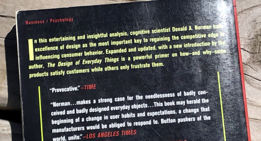
Has something like this happened to you? Have you tried to use something you think should just work, or find something on an item where you’d least expect it? This time it was a car, other times it’s a lamp, or even computer software. This thinking and frustration is the premise of the book The Design of Everyday Things by Donald Norman, an expert on usability.
Going thru some books I already read and still held onto, I decided to reread this classic book, and it brought back memories of the first time I read it; good memories from the material I learned in the book and bad ones because there’s still a lot of design issues out there that cause for poor user experiences. Those memories are structured into the following takeaways.
It’s not just us – When we have a poor user experience or trouble doing something, we tend to beat on ourselves. I have seen this a lot with computers, as some people are expecting a computer to just “do” something, and they often need more information, like a manual or someone to show them how, in order to complete a task. This happens to myself with software, Web sites or apps as well; I, someone who builds these, am expecting something or a certain outcome, and am not finding it that way. I chalk these up to bad design, where the one who created it never took into consideration how people would use it, or got feedback from observing people using it.
Internal vs. External Knowledge – This concept refers to internal knowledge as “in the head” as compared to external as “in the world” knowledge. Examples include knowing how to do something vs. having a manual or instructions on how to do it, to remembering a birthday to getting a calendar alert to remind you it is someone’s birthday. We bring internal knowledge into every situation, but sometimes need external knowledge to reinforce or remind or simply tell us how to do whatever it is.
There is good design out there – Where the book highlights a lot of bad design, it does talk about good design. I often reflect on an experience – e.g. driving a different car or going to a new place – and think of the user experience. I will smile if it was a good experience and complain if it wasn’t.
Bad design is an ongoing concern –The edition of The Design of Everyday Things I read was republished in 2002, and its original version came out in 1988 (note a later version was revised and expanded in 2013). Now 17 years after the republish, where a reader may get a chuckle when seeing some of the “dated” examples of items with poor design (for example, the telephone pictured), the principles written by Norman years ago are still very relevant today.
The Design of Everyday Things is not solely about computers or technology. I say this as perhaps my examples or even my background may imply this, plus the fact Donald Norman is a co-founder of Nielsen Norman Group - a firm that works in design and user experience, a lot of it centered on technology but not exclusively. I recommend this to any psychologist or student of the mind to anyone who gets easily frustrated when things don’t just work for them, or both. As I pass along all books, I am finally offloading this one, giving it to someone whom I met at a networking event a while back and to whom I offered the book… whether she has the internal knowledge of this, or needs this post as external knowledge, I will soon find out.
This is from The Hot Iron, a journal on business and technology by Mike Maddaloni.
Did you enjoy this? Subscribe to The Hot Iron by RSS/XML feed or Read by Email
Book Take-Aways •
Web Design •
(1) Comments •
Permalink

