Initial Thoughts On The Nokia E7
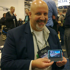 When I was preparing to attend the Microsoft TechEd Europe conference last week, I was hoping I would get my hands on the new, yet-to-be-released Nokia E7 smartphone. As TechEd is a business technology conference, and the E7 is being positioned as a business mobile device, I was pretty confident there would be an E7 or 2 available for me to try.
The good news is there was, however they were the personal devices of the Nokia staff who were there for the show and working at the booth. So where I was able to hold and try an E7, nobody handed me one and told me to walk around the exhibit floor and take it for a test drive. As a result, I had limited access, but enough to collect some initial thoughts and opinions which may be of value for others. I have also listed a number of things I would like to try out once the device is released. Interestingly, it was also the first time I had my hands on a Nokia N8, which came in handy for comparison of the 2 devices.
First, here’s my initial thoughts, and not necessarily in a priority order:
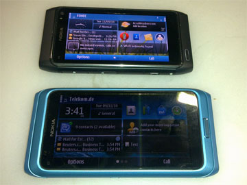
- Good size – The E7 has a decent-sized screen. When the keyboard is “stored” under the device, it fits well in your hand and is not too bulky. After sliding the keyboard out, it is practical to type and use while holding in my hands as well as placing it on a flat surface. It is also a bit larger than the N8, as you can see from this angled yet side-by-side comparison photo I took.
- Solid – A hallmark of Nokias is they are solidly built, and the E7 continues this tradition. When I attempted to slide out the keyboard for the first time, I was cautious as I didn’t want to do it with too much force. But once I did it and a few more times, I got the hang of it. The keyboard can take a little pressure on the slide mechanism.
- Decent keyboard – The keyboard is more like the N97 than the E75, which is a good thing. There are arrow keys rather than a joystick, which is preferred to me, especially on a touchscreen device. I say the keyboard is good, and to make it great would be to add an additional row of keys so I don’t have to press an “alt” key to type numbers. But it does have 4 rows of keys as compared to 3 on the N97.
- Memory – The E7 has 16 GB of memory on-board. I asked how much available memory was free on the device when it is shipped, and I was told it was about 14 GB, as there are core files and some audio and images and video shipped on the device. There is no memory card slot, and some have had issue with this. Personally, Micro SD cards are too darn small for my big hands. The E7 has a Micro USB connector, and with an adapter cable you can connect a USB Flash drive. I saw a demo of this – when connected, you can browse the Flash drive just as if was an inserted memory card. You can also run files off the Flash drive, including video and presentations, which to me looked seamless.
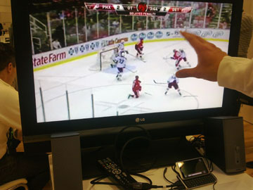
- Video – I saw 2 examples of this. First was a video file played off a Flash drive, and as I said above it looked fine. I also saw NHL Gamecenter, an app which shows clips of hockey games. I watched this both on the device as well as when it was connected to an HDTV using its HDMI out port. The video quality was very good on the E7 and good on the HDTV, though there was some pixilation. My assumption is this was due to the compression of the video itself as it is probably optimized to deliver over a mobile network. The photo below is of a game clip on an HDTV from the E7.
- Camera - The camera on the E7 is 8 megapixels, as compared to a 12 megapixel Carl Zeiss lens on the N8. When I asked about this, I was told part of the decision-making was the price of the device, and part was that in order to have the Zeiss lens on the N8, it extends from the back of the device, which if done on the E7 it would not be able to lay flat on a surface. This makes sense as you won’t always be holding it when typing.
So what did I want to do that I did not have the opportunity to? Here’s a few things:
- Take video and photos and look at them on my PC.
- Try reading text outside in sunlight and in a dimly lit room, as well as see how much I can adjust the text size.
- View PDF documents.
- Write and edit a blog post.
- Surfing the Web, including hitting various eCommerce Web sites.
In short, I would want to use it as I do my E72 device on a daily basis.
One last thought – orange would be my color of choice! It’s a unique color and the metallic color looks impressive, plus it will match my luggage.
I hope my initial thoughts are of some help. What are your thoughts on what you have seen and heard on the E7 so far?
Did you enjoy reading this? You are welcome to subscribe to The Hot Iron by RSS feed or by email.
New Web Site Launched For Spartan Charters
 At Dunkirk Systems, LLC we are proud to have brought many clients to the Web for the first time. With the launch of the Web site for charter fishing service Spartan Charters we continue along this great tradition.
Spartan Charters is a full service charter company servicing Cape Cod, the Islands, and Southeastern Massachusetts and is a complete fishing guide and charter service. With their fleet of great fishing vessels and 2 experienced captains, Spartan ensures you have a quality and great fishing experience. As they say, they target big fish.
For this project Dunkirk partnered once again with Visible Logic, Inc. to great a highly functional Web site with a great design. The home page design is compelling to draw users to the various sections within the Web site, plus all navigational links are stylized text links, rather than images. A custom-developed content management system (CMS) powers the Web site allowing the Spartan Charters team to modify all Web site content. They are also embracing social media with their Facebook page and Flickr account with a wide variety of photos from past trips and catches.
Whether you’re a seasoned fisherman or looking to entertain clients or guests with a fishing experience, Spartan Charters is the one to call… or contact through their new Web site.
Did you enjoy reading this? You are welcome to subscribe to The Hot Iron by RSS feed or by email.
Linking To Content You Cannot Link To
 Believe it or not, there are times you want to directly link to something from your Web site but you cannot. Despite this, there are ways you can still promote what it is you want to link to.
What Possibly Are You Talking About?
The following are a few scenarios where you cannot directly link to something on the Web.
- The publication’s Web site does not post its articles online
- The publication’s Web site requires registration or payment to view the article
- The article is no longer on the publication’s Web site
There are all real-life scenarios and have happened to clients as well as myself.
Credit Where Credit Is Due
Whenever you are referencing content belonging to someone else on the Web, it is always a good idea to get their permission. In some cases you may not be able to mention specifics, such as a company or publication name or even the title of the work or article, but you’ll want to find out as much as you can about what you can mention.
Here’s a real example, and names have been changed to protect the innocent. A client of mine wants to link to articles she writes for a cooking magazine on her Web site, and in some cases she even wants to republish full or partial copy from the article. The published does not post articles online, and does not want her to post any of the articles on her own site. However, she can mention the name of the magazine, issue date and number, article title and page number. She can even show a thumbnail of the magazine cover. In this case, we posted all of this information, plus the photo, with a link to the magazine’s Web site.
If, for example, the article is available online but only to online subscribers, we can still link to it, and below the link we can mention this is behind a login which requires signup and payment. This brief disclaimer will show goodwill to the magazine, all the while promoting the fact the client wrote in it.
Striving for the Win-Win
In-bound links to a Web site are always desired and welcomed by a site owner. Depending on your business relationship with a Web site may dictate how you can present a link to promote yourself with their name. If the situation arises, seek out the method where you can present the most you can, and as a result creating a win-win situation.
Did you enjoy reading this? You are welcome to subscribe to The Hot Iron by RSS feed or by email.
Is Your Branding And Logo Easily Identifiable On Your Web Site
Editor’s Note – This post is in follow-up and support of The State of Your Web Site, a checklist from Dunkirk Systems, LLC which helps guide Web site owners to objectivity on the current state of their Web site. You can download a free, no obligation PDF copy at TheStateOfYourWebSite.com.
There is a reason for having a logo and branding. On the most basic level, it helps identify who you are to others. Whether you are the world’s largest razor blade company or the newest cupcake shop downtown, having a unique look and style and overall package of how you present yourself is important to your company. The same also holds for most all businesses, not to mention organizations and even individuals.
So why wouldn’t you extend this to your Web site? Before you ask yourself why I am asking this, think for a minute and you may recall a site or several where it was not readily clear who owned the Web site! Whether the logo or brand simply wasn’t there or obscured or someplace where it wasn’t expected, not having your brand prominent on your Web site can be a hindrance to your success online.
I believe in this so much that it is the #1 question asked on Dunkirk’s The State of Your Web Site checklist!
Why does this matter? Web visitors have a short attention span, and this has been proven with user testing. If within a few seconds a visitor to your Web site cannot determine whose Web site it is as well as find the information they are seeking, they may go elsewhere.
Making your logo prominent on your Web site and carrying through your branding to the Web site are not a matter of ego. You have invested in these, and they should be present on your Web site. Companies of all sizes may have Web standards developed along with their branding and logo to help guide this. In the absence of this, working with a graphic designer who understands the importance of branding – ideally the same designer who created your brand and logo – will help extend it to the Web.
By doing so does not mean your Web site will lack creativity. A creative designer will be able to prominently incorporate your brand and logo into your Web design! I have seen cases where the logo is “buried” somewhere in the Web site or landing page in the name of creative design. Buried can be defined as the logo being modified to fit the design but lose qualities unique to it, aligned to the right or bottom of the Web page so it is not readily seen “above the fold” of the Web page or simply left off. A balance must be struck to reinforce who you and your firm are with a great design.
A final tip is to make your logo a clickable link to your home page. It is common practice to make your logo a fast-track to the top of your Web site.
Ensuring your brand and logo are easily identifiable on your Web site is one step towards improving The State of Your Web Site.
Did you enjoy reading this? You are welcome to subscribe to The Hot Iron by RSS feed or by email.
A Horrendous Unusable Email Address
IT departments are often criticized for thinking only of technology and not about the end users in an organization. Where IT can be an easy target, in many cases the critique is correct. Here’s a perfect example in the form of following technical standards and missing the goal the technology is to be used for.
 The other day I was walking through Block 37, a retail complex in Chicago’s Loop, and saw a sign as shown in the accompanying photo. The Disney Store is going to open in one of the many available retail spaces, confirming what I had read in the local media. As is often the case with a retail “coming soon” sign, there was a call for people to work at the forthcoming store, or as Disney calls it, a casting call. Though I was not interested in working there, I read the sign nonetheless, and almost choked when I got to the end of it, reading aloud at this point the email address listed, as shown in detail below.

If you cannot read the email address in the photo, it is: .(JavaScript must be enabled to view this email address). Yes, this is correct. I have seen complicated email addresses in my life, but this one by far is the worst I have ever seen!
This email address is far from usable, and is prone to all kinds of misspellings and mistyping errors. From a usability standpoint, it is anything from memorable. If someone is walking by the sign and doesn’t have a pen or any other way to write it down or enter into a mobile device, forget the possibility of remembering it. From a data-entry perspective, an email address with mixed case and 5 periods will surely be typed incorrectly when used in an email address, or even if someone is jotting it in their device for later use. It is not known if the capital letters are case-sensitive or not.
This email address is more than likely in compliant with a corporate IT standard of The Walt Disney Company. Where that’s all well and good, marketing or HR should have stepped in and asked for a much more user-friendly email address. I did a quick search of domain names which could have been coupled with this email address, and disneyjobs.com and disneystore.com are names they already own, and have Web sites at them. An email address of .(JavaScript must be enabled to view this email address) or .(JavaScript must be enabled to view this email address) could have worked. A new domain names like disneychicago.com could have been registered for a few dollars and have email redirected to the complicated address. Or forget email – a link to the Disney Jobs site may be the preferred method of getting prospective employees.
And all this criticism is coming from someone who has worked his entire career in computers! What is needed is IT leadership who understands people need to use the technology they build and support, and this should be a joint effort with marketing or HR to come up with a unique, short, memorable email address or Web site to entice people to email their resume for a position. Granted in this economy people who are looking for jobs will go to extraordinary means to get one. But why make them do more work than they – or anyone else – should?
For the sake of full disclosure (and to satisfy the FTC), I do own a few shares of Disney stock, which makes this even more embarrassing for me.
Did you enjoy reading this? You are welcome to subscribe to The Hot Iron by RSS feed or by email.

